A few weeks ago, I wrote a post about how much I love vivid, saturated colors and how they draw my eye. It may seem contradictory, then, to devote a post to my love for the exact opposite of color – the monochromatic world of black and white!
Stripping a scene of its hues may feel impossibly dull for someone who loves the brightness and infinite variations of colors. It may seem unnatural to render a scene or a portrait colorless, not to mention counterintuitive to revert back in time – having made so much progress in photography in our hyper-colored, super-digital world, what on earth would we find appealing about deliberately recreating a historical limitation in the art?
And yet, so many photographers seek to master this style, as successful B&W images can be profoundly artistic in their storytelling and powerful in mood. What you strip away in color, you gain in feeling – or at least, that is how it should be when done successfully.
There is something generally attractive and valued in what is vintage, and something artistic in creating an image that is an imaginative alteration of reality. In doing so, photography suddenly gains the ability to become like a praised antique or reaches the rank of a fine-art painting or sketch. But merely transforming any scene into B&W is not enough. As I have come to realize after much experimenting and trial and error, not all images "feel right" in B&W. So what makes a B&W image give you that "YES!" feeling?
Most often, we are stimulated by color when we choose to photograph a scene. Be it in a natural landscape or an urban scene, the elements that grab our attention usually do so because of their color. Think about it – the ocean, nature, a street scene, an urban market, anything against a blue sky. Would you reach for your camera as often if your world had but two colors - black and white? What would you photograph, if anything, if your eyes were staring at a black and white scene? If you ask yourself that question next time you're out for a stroll with your camera, you may immediately notice that your attention shifts towards different elements:
Imagine how easy it would be to overlook those subtleties if saturated blues and reds and greens were staring at you in the face, praying for your attention! I suppose this trains you to look beyond what you see – to peel away that first layer of reality in search of something more.
This is precisely the reason I love B&W. What you see is not what you get. Effort is required on your part to actually look. If you read a bit of the description 'about my snapshots', you already know how much I enjoy the power of simplicity in photographs. With B&W, what is simple and ordinary has a chance to be glorified, with a bit of experimentation and a lot of heart.
Stripping a scene of its hues may feel impossibly dull for someone who loves the brightness and infinite variations of colors. It may seem unnatural to render a scene or a portrait colorless, not to mention counterintuitive to revert back in time – having made so much progress in photography in our hyper-colored, super-digital world, what on earth would we find appealing about deliberately recreating a historical limitation in the art?
And yet, so many photographers seek to master this style, as successful B&W images can be profoundly artistic in their storytelling and powerful in mood. What you strip away in color, you gain in feeling – or at least, that is how it should be when done successfully.
There is something generally attractive and valued in what is vintage, and something artistic in creating an image that is an imaginative alteration of reality. In doing so, photography suddenly gains the ability to become like a praised antique or reaches the rank of a fine-art painting or sketch. But merely transforming any scene into B&W is not enough. As I have come to realize after much experimenting and trial and error, not all images "feel right" in B&W. So what makes a B&W image give you that "YES!" feeling?
Most often, we are stimulated by color when we choose to photograph a scene. Be it in a natural landscape or an urban scene, the elements that grab our attention usually do so because of their color. Think about it – the ocean, nature, a street scene, an urban market, anything against a blue sky. Would you reach for your camera as often if your world had but two colors - black and white? What would you photograph, if anything, if your eyes were staring at a black and white scene? If you ask yourself that question next time you're out for a stroll with your camera, you may immediately notice that your attention shifts towards different elements:
- Light, and the shadows and highlights it playfully creates.
- Contrasts – not in colors but in tones. Think of the scene in terms of black, white and various shades of grey. The sky is often an interesting example of how this changes. What seems white on blue suddenly becomes more complex in B&W, with intermediate swirls of grey and deeper blacks in some spots but not others.
- Lines and patterns and textures and shapes. Some of my favorite friends! It is amusing and astounding how such "low-level" or basic elements can manage to enhance the mood of any image, or how removing one sense (color) can elicit new senses (tactile perceptions).
- Fog, smoke, mist, raindrops. Any elements of a transient nature that are much too subdued to take center-stage in a full-fledged color photograph really seem to come to life in B&W.
Imagine how easy it would be to overlook those subtleties if saturated blues and reds and greens were staring at you in the face, praying for your attention! I suppose this trains you to look beyond what you see – to peel away that first layer of reality in search of something more.
This is precisely the reason I love B&W. What you see is not what you get. Effort is required on your part to actually look. If you read a bit of the description 'about my snapshots', you already know how much I enjoy the power of simplicity in photographs. With B&W, what is simple and ordinary has a chance to be glorified, with a bit of experimentation and a lot of heart.
I think that is also why I love experimenting with so many different mediums - acrylic, aluminum, canvas, wood, paper. All of these have different textures, different personalities, different affinities for elements that either become pushed into focus or that take a backseat. It's always interesting to watch the same piece get transformed in spirit when it is printed on a different medium.
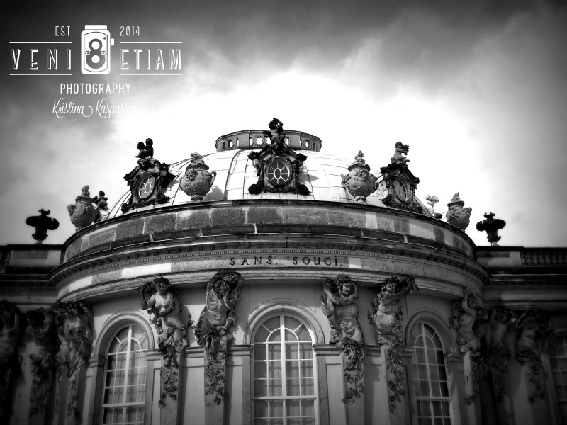
In this post, one of my favorite B&W images is showcased on acrylic.
It is called "Sans Souci" (French for 'without worry'). The title has a double meaning. Not only is it the name of the Palace depicted in it (Schloss Sanssouci in Potsdam, Germany), but it was also taken during a season of my life where I very much felt like the world was my oyster and any dream was within reach. It was a year of a deep sense of childlike exuberance, a strange time of inexplicable connections and inspiration continuously slapping me in the face, as if holding up a sign that read, "This is your life – you are so fortunate". It was a brief moment of simplicity and peace that preceded a crossroads where a choice was forcibly made between two parallel worlds. I originally took this photo in color and later converted it to B&W. The result was an intense mood - a moment of stillness conveyed by the solid architecture, intersecting with the movement and change brought on by the sky.
Acrylic is usually my medium of choice for photographs with crisp, vibrant colors. But with its perfect ability to preserve sharp details and enhance depth, it turned out to be a stunning choice for B&W. Depicted here is the thin acrylic option (sleeker and airier) with the floater frame (wood backing). The floater frame is invisible from frontal view, but impressively allows the acrylic to "float" off the wall. The standoffs, on the other hand, achieve the same "off the wall" effect, but add a more pronounced modern feel, as they are visible on each of the four corners of the art.
So you see, B&W photographs may be devoid of color, but certainly not of life or feeling! Keep me posted on your impressions and on your own experimentation with B&Ws in the comments below!


 RSS Feed