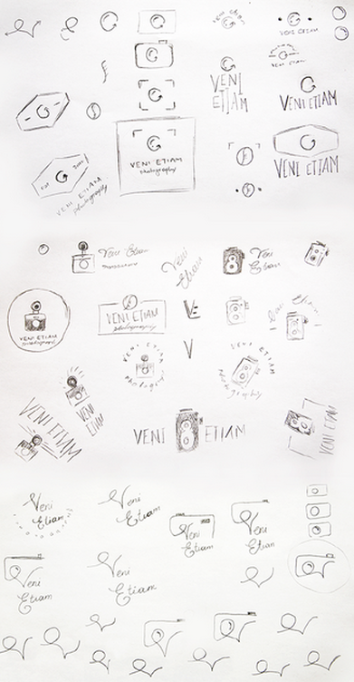
I intuitively turned to a duet of talented designers – Santhi Thomaidi and Lefteris Protopapas, known as Alati design. We had met in Greece some years ago and I had continued to follow their creative projects from afar. I trusted them from the start, without a second thought. What I didn't know at that time, though, was how rewarding and how much fun our collaboration would be, and how much more than a logo I would gain from the experience.
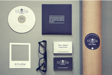
When I first contacted them, I knew I needed to design a logo, a business card and some stationery. What I quickly learned through them is that what we needed to design, in fact, was so much more than those basic elements; we needed to create a visual identity for Veni Etiam – a consistent and recognizable look that would visually communicate the essence of the brand. What makes it special and engaging?
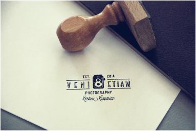
I approached them with a summary of what Veni Etiam stood for, and what I hoped it would embody. I had wanted a nostalgic, retro feel – a vintage camera, and classy fonts. I knew I wanted it to look streamlined and crisp, elegant and memorable - safely balanced on the spectrum between old-fashioned and modern. As a starting point, I sent them a few hues of blue, inspired by my love for the Sea and all things maritime, and mentioned that I also imagined a calm charcoal grey. I didn't need to say much else for them to get their design engines running! They absorbed everything I said, mixed it in with their own creative vision of the project, and added generous portions of their impressive talent.
| Our collaboration was exciting, productive and respectful. We brainstormed, they delivered, I commented, they revised, I suggested, they advised – back and forth, from Canada to Greece and back again. With their clever ideas, meticulousness, and thorough knowledge of design principles, I truly felt like Veni Etiam's image was in good hands! |
(And I do! Check out their portfolio and follow their creative endeavors on Facebook!)



 RSS Feed